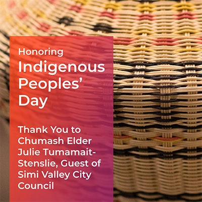
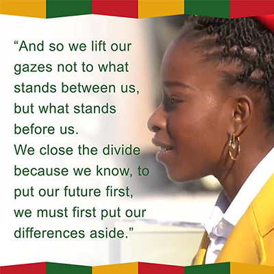
A candidate with refreshing ideas and a positive outlook needs bright and bold colors that reflect who she is and what she stands for. A grass-roots campaign needs reusable creative assets and guidance to ensure consistency, whether the posts are created by pros or volunteers.
For this Congressional campaign, we created custom templates, a library of reusable images and other graphic elements, and a style guide to ensure consistent and professional communications.
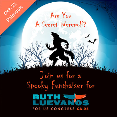
Political races may be serious, but nothing says that fundraisers can't be fun. Here, social posts, an event page graphic, and an email banner for an imaginative fundraiser combine event and holiday themes with the campaign's logo and branding colors.
Images are a combination of stock illustrations and original art. Note that on the event page banner (lower right), all the text is in the center, so it can still be viewed clearly when resized for a phone. See the event video on our Video Portfolio page.
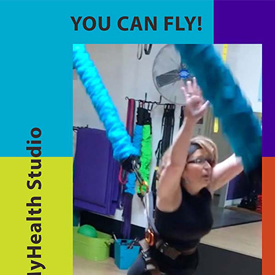
What we had: a vibrant palette that the client had already developed. What we didn't have: any photos except for what we could screen-grab from low-res video.
What we did: subtly edit the photos to focus on the people, and let the palette carry the message that this studio makes fitness fun. In the process, we created a set of post templates that the client could use on their own.
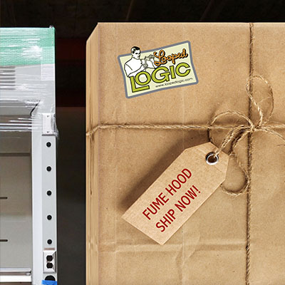
To get meaningful results from social media campaigns, consistent branding is key. These posts are very different, but both are representations of Looped LOGIC's irreverent brand of lab furniture. The post on the left announces a new eCommerce website with a vintage illustration in the same style as the company logo. The post on the right lends reality to a bold claim: that Looped LOGIC can ship fume hoods from stock (fume hoods typically need 3-4 months of lead time).
It does it in typically Looped LOGIC fashion, with an actual photo of fume hoods in stock, one of them wrapped for shipping. The giant tag and string are callbacks to other Looped LOGIC advertising, and to the company's trade show presentation.
Posts, placed social ads, social video, and event page banners were the social media components of a campaign that also included email and community flyers.
More info on this project:
Download case study for more information on this fascinating project.
A traditional social media "calendar", where a brand does a pro-forma "celebration" of every holiday from New Year's Eve to National Pickle Day, has very little value on its own. It really only works when you can tie it into the brand in a way that's meaningful to the target audience and the brand.
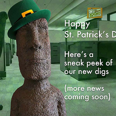
In this case, the unusual prop -- purchased years ago from a garden center -- has become a familiar "star" in the client's ads. Giving it a jaunty St. Patrick's Day hat, and hiding the new offices behind a thin veil of green, is in keeping with the cheeky approach for this brand, and would be familiar to its audience.
Social posts for a much-needed, pandemic-safe community children's event included save-the-date posts and sponsorship posts.
Animated video, a live-streamed drawing for free tickets, and careful social media ad placement and partnerships generated more than 14,000 visits to the FB page and thousands of dollars in tickets for the arts non-profit.
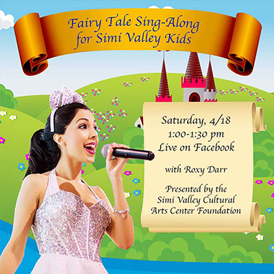
What looks like two versions of a single image is actually a photo of the performer -- carefully clipped from a cramped indoor space and edited to remove unattractive lighting and shadows -- a fairy-tale setting created from four different vector images, and some text.
To get from Point A -- just the photo of the performer -- to the finished image, we thought about the experience we were offering, and how we could use stock images to visually tell a story about it.
As one of our colleagues has said, "The trick is not just owning a hammer. The trick is knowing where to pound the nail."
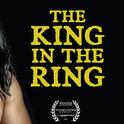
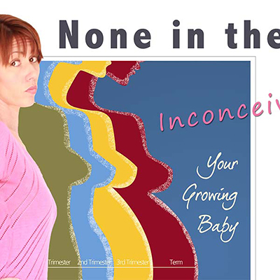
Banners and other social art had to do double-duty for this limited web series. At first, the filmmakers used them to promote the series. But as the project got positive press, we also created high-res and web-ready versions of the poster, digital art, social art, and behind-the-scenes photos and created a website press page where journalists and publications could download resources to meet their needs.
The series was showcased in online and print media, including Family Circle in the U.S. a popular parenting magazine in Australia and a leading infertility blog in India.
Here's another example of a holiday post that makes sense. For Black History Month, a community arts organization honored actors, a poet, and an author. A series of static posts and a video slide show carried the themes of "Trailblazers" and "Inspirations".
Remarketing ad campaigns require creating the same assets in many different sizes and formats, so that ad network partners have the size they need. Here are two of more than a dozen different versions of the same ad.
Today's new content creation tools, like Adobe XD, make this process much easier and more cost-effective.
One of a series of banner ads for UCLA & Anthem.
Piece of cake? Hit or miss? Wandering in the wilderness? Drinking from a firehose?
Most important, are your social and digital advertising campaigns delivering the results you're after — as measured in revenue?
If your experience is anything other than confident, productive, and effective, C3 Advertising is here to help.
We can offer simple guidance and focus, comprehensive marketing plans that guide you in allocating resources among all your marketing channels, supplemental content and/or content editing (including video), or complete turnkey programs. The choice is yours.
Learn more about C3 Advertising Social Media services and packages